Submit the following programs via the honors section of Gradescope:
- HC 1: Neighborhoods of the L-Train Stations Due Date: 7 September
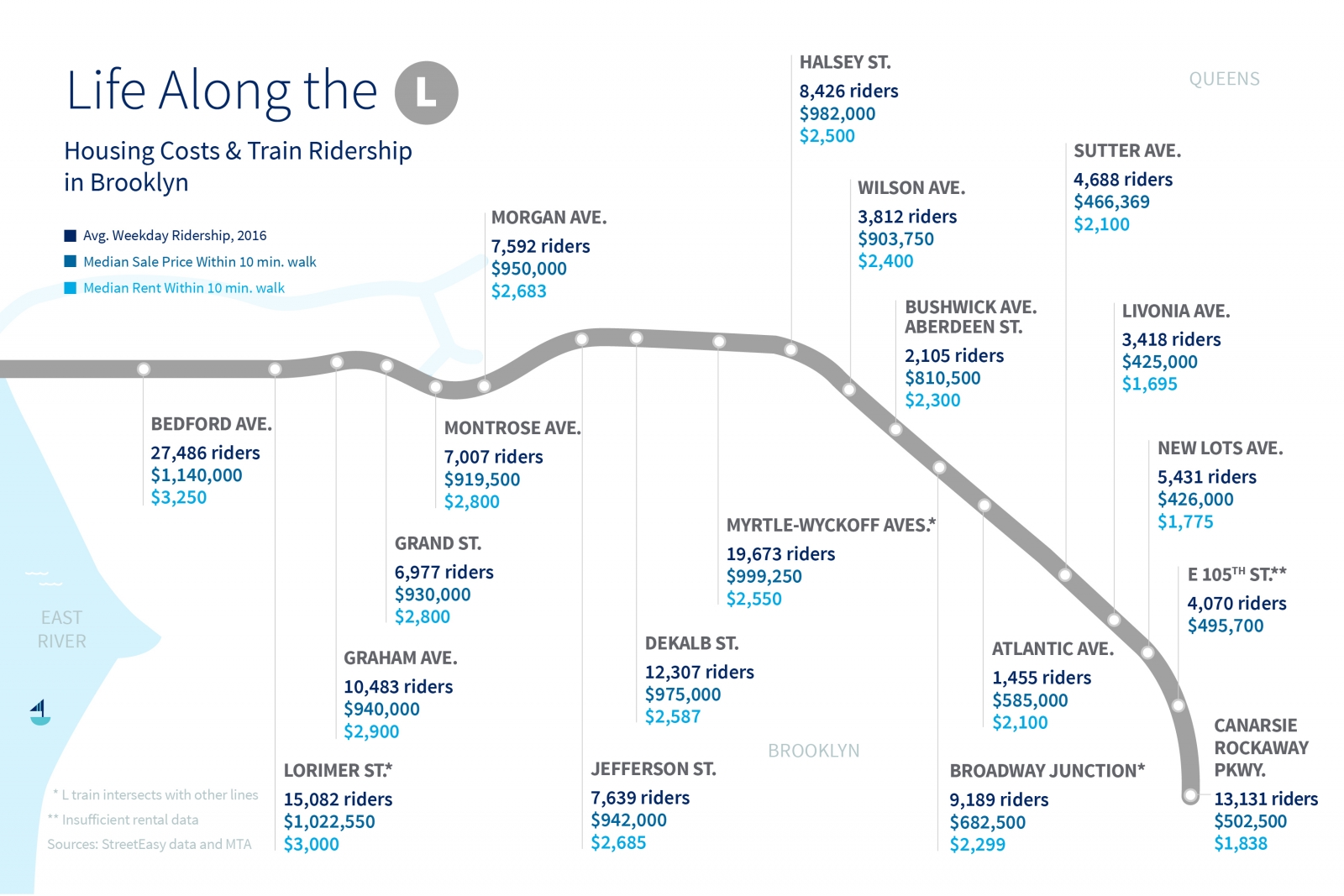
Throughout the semester, we will focus on the upcoming L-train tunnel closure:
For 15 months starting in April of 2019, all MTA New York City Transit (NYCT) L train service will be suspended across the East River and within Manhattan to repair damage caused by Superstorm Sandy. The L train will still run within Brooklyn, serving all stops. The temporary closure will directly affect 275,000 of the L Train's 400,000 daily riders, and indirectly affect many more throughout the city. All alternative transit services and traffic management policies are temporary for the duration of the L train closure.
and its effects on nearby neighborhoods in New York City.To begin, pick a neighborhood (i.e. choose one along the L-train and sign up on Blackboard). Create a single page summary of your neighborhood that includes:
- Name of the neighborhood (include in the title),
- The zip code(s) of your neighborhood,
- The census tracts encompassing your neighborhood (see Census Tract Finder),
- A map of New York City with your neighborhood highlighted,
- An photo or image that captures your neighborhood,
- The demographics of your neighborhood, and
- The distance of your neighborhood to Federal Hall and to Empire State Building.
Note: upload a .pdf to the assignment HC 1. in the honors section of Gradescope. Unlike the Python code, it is not automatically graded.
- HC 2: Cost of Commuting
Due Date: 14 September
FiveThirtyEight analyzed the cost of commuting in terms of the extra New Yorkers were willing to pay to lessen their commute. StreetEasy did a similar analysis, measuring from given subway stops (and includes a lovely Tableaux map-- scroll down).
How will the L-train tunnel closure affect housing prices? To narrow down the analysis, we will focus on the distance to two landmarks: Empire State Building (as a proxy for midtown) and Federal Hall (for the financial district) and 3 locations. You may find WNYC Transit Time or Google Maps useful, as well as CityMapper. Pick, at random, three rentals in your neighborhood.
- Compute the shortest commute driving to the Empire State Building or Federal Hall for those locations. Assume that you are arriving at 8:30am on a weekday.
- Compute the shortest commute by public transit to the Empire State Building or Federal Hall for those locations. Assume that you are arriving at 8:30am on a weekday.
- Compute the shortest commute by public transit, not using the L-train, to the Empire State Building or Federal Hall for those locations. Assume that you are arriving at 8:30am on a weekday.
Using the analysis from FiveThirtyEight, predict what the tunnel closure will do to the prices of your three chosen apartments. Justify your answer.
Submit a .pdf file analyzing the time and cost of commuting of your neighborhood. You should use complete sentences and justify your answers with data.
- HC 3: Transit Capacity Due Date: 21 September
The MTA predicts that 275,000 daily riders will be directly affected by the L-train tunnel closure. How can that be replaced by existing transit options? Submit a single page (.pdf file) containing the following information:
- What is the capacity of the L-train during the morning commute? Include your calculation that how many people each train can hold and the number of trains between 6 and 10am. Some useful links: R160 Subway Car and L Train Schedule.
- Assuming a bus lane has capacity of 6,000/hour, how many would be needed to replace the L-train during the morning commute?
- Assuming the ferries with the largest capacity (400 passengers), how many would be needed to replace the L-train during the morning commute? What frequency would the ferries need to run to match the L-train service?
- If no transit options were available, and everyone drove in a single occupancy car, how many lanes of traffic would be needed to replace the L-train service (assume capacity of 1,440/hour,)?
- If no transit options were available, how many bike lanes would be needed? Assume each bike lane has capacity of 5,200/hour.
Submit a .pdf file analyzing the density and zoning of your neighborhood. You should use complete sentences and justify your answers with data from the readings.
- HC 4: Neighborhood Rankings Due Date: 28 September
Working in pairs or triples, design a ranking for most desirable features of a neighborhood.
There are multiple rankings of New York City Neighborhoods. For example,
- Niche,
- DNA Info's rankings,
- Brick Underground,
- Curbed's Walkable Neighborhoods,
- BuzzFeed,
- Street Advisor
- Assess what these rankings have in common and how they differ.
- Which ranking do you favor and why?
- What qualities make a neighborhood desirable place to live?
- Collate a list of the three most important.
Submit a .pdf file containing your assessment of the rankings and the three most desirable qualities. You should use complete sentences, compare and contrast the rankings above, and justify the three qualities that your group thought most important.
- HC 5: Walking in NYC Neighborhoods
Due Date: 5 October
Urban planner, Jeff Speck, argues that if a city succeeds at being walkable, it excels at having a high quality of life (see his TED talk).
Working in pairs or triples, analyze his argument in terms of five neighborhoods in New York City and the ranking you determined in HC 4. For five of the neighborhoods chosen by class (1-page summaries from HC 1 are available on Blackboard), determine the following:
- Rank the five neighborhoods by your ranking from HC 4. Explain how you determined the neighborhoods ranked (you can have ties, but you need to justify the rankings, even in the case of ties).
- How did the 5 neighborhoods do in terms of walkability (order the neighborhoods by their walk scores).
Does your ranking concur with ranking the neighborhoods by walkability? Justify your answer.
Submit a .pdf file analyzing the your rankings and walkability of five neighborhoods chosen for the class. You should use complete sentences and justify your answers with data.
- HC 6: Neighborhood geoJSON Map
Due Date: 12 October
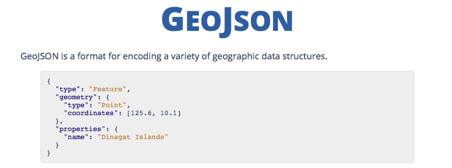
Using the geoJSON mapper (see geoJSON notes), make a JSON file that includes the following features:
- Your L-train neighborhood marked as a region (e.g. polygon),
- The L-train (marked as a gray line),
- Other major transportation corridors (e.g. subway lines, major bus routes, or major roads) marked as lines, and
- Transit stops on your subway lines and major bus routes (marked as points).
Commit to github, and view using the github preview button (you should see you encoding rendered graphically on a map).
Submit a screenshot of your map as a .pdf file.
- HC 7: Highlighted Map Due Date: 19 October
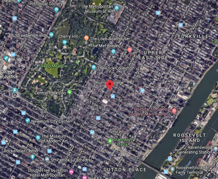
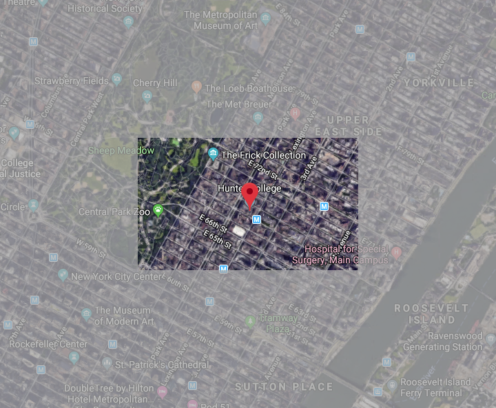
For this program, we will create a highlighted map around your station, with the region within about a 1/4 mile box at full brightness, the region that outside that box at 50% brightness.
To do this:
- Create a .png file of a satellite map, centered on your L-station (Google maps works well for this, but you can use any mapping site to create your base map).
- Write a Python program that reads in an image and saves the image to another file. Run your program to make sure the reading and saving of an image works.
- Set the upper region of the image to 50% brightness (hint: uses slices and see example in Lecture 3 and 4). Run your program to make sure it has dimmed up the upper region and adjust to get the correct dimenssions.
- Set the lower region of the image to 50% brightness (hint: think about what negative numbers mean as indices). Run your program and fix any bugs.
- Next, dim the side regions (hint: think about what parts of the image have not been dimmed and change only those regions.)
Submit your answer as a .pdf file to gradescope.
- HC 8: Turnstile Entries Due Date: 26 October
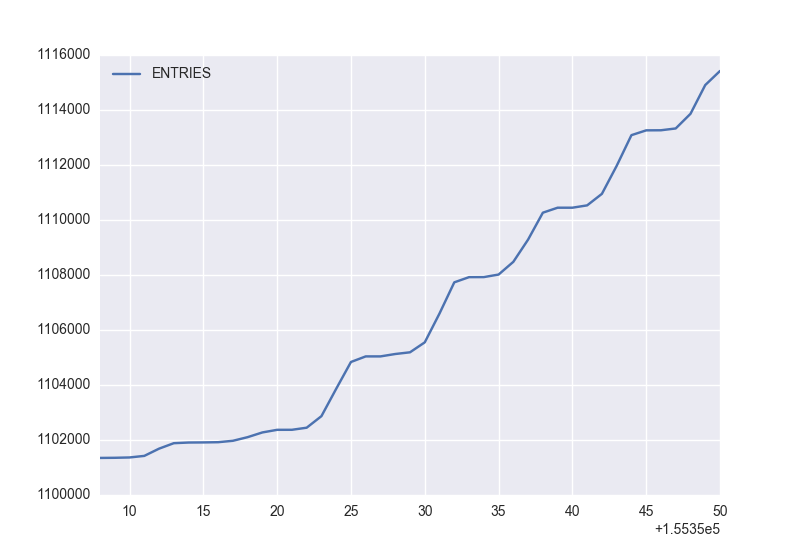
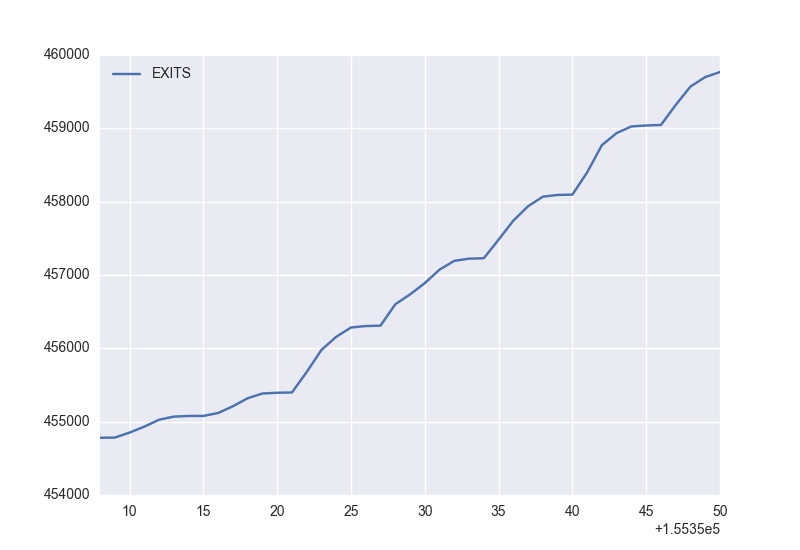
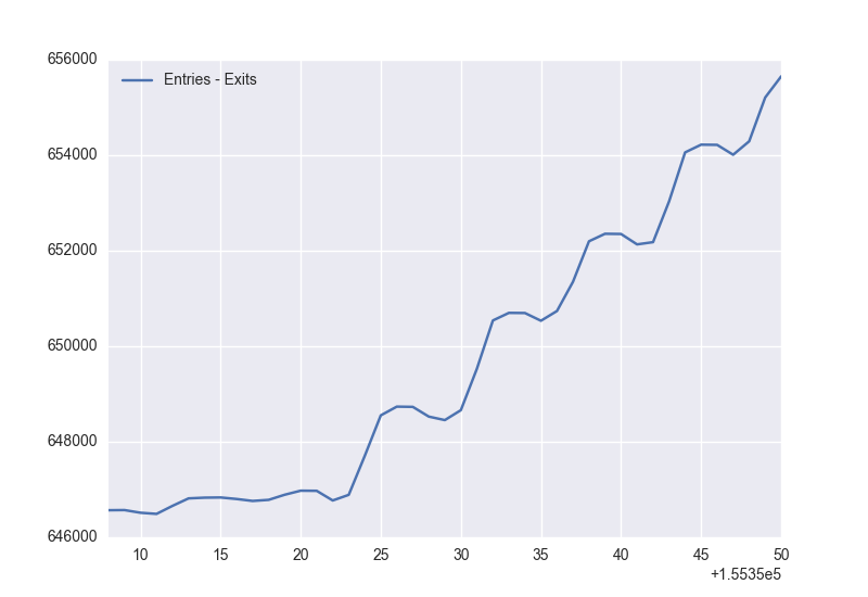
(Entries, exits, and difference via turnstile #1 at 68th Street-Hunter College station for the week ending 1 September 2018)In Lab 7 (24 October), we introduced NYC OpenData. As part of the OpenData initiative, the MTA releases information about the subways, buses, and commuter trains. To access the real-time data, MTA provides feeds (requires registration). We will focus on the historical data stored about stations.
THe MTA keeps track of the number of people entering and exiting each station via the turnstiles. Readings of how many people entered and exited are measured every 4 hours. Some stations measure the numbers at midnight, 4am, 8am, noon, 4pm, and 8pm. Others are measured on slightly shifted schedules, but always 4 hours apart. For example, the 68th Street-Hunter College station has each turnstile measured at 1am, 5am, 9am, 1pm, 5pm, and 9pm. These numbers are recorded as cumulative running totals. For example, here is some of the data from the 68th Street-Hunter College station for September 22:
C/A,UNIT,SCP,STATION,LINENAME,DIVISION,DATE,TIME,DESC,ENTRIES,EXITS
R246,R177,00-00-00,68ST-HUNTER CO,6,IRT,09/22/2018,01:00:00,REGULAR,0026638604,0015384642
R246,R177,00-00-00,68ST-HUNTER CO,6,IRT,09/22/2018,05:00:00,REGULAR,0026638606,0015384646
R246,R177,00-00-00,68ST-HUNTER CO,6,IRT,09/22/2018,09:00:00,REGULAR,0026638640,0015384847
R246,R177,00-00-00,68ST-HUNTER CO,6,IRT,09/22/2018,13:00:00,REGULAR,0026638946,0015385117
R246,R177,00-00-00,68ST-HUNTER CO,6,IRT,09/22/2018,17:00:00,REGULAR,0026639543,0015385340
R246,R177,00-00-00,68ST-HUNTER CO,6,IRT,09/22/2018,21:00:00,REGULAR,0026639975,0015385496
R246,R177,00-00-00,68ST-HUNTER CO,6,IRT,09/23/2018,01:00:00,REGULAR,0026640099,0015385542
The last two entries on the lines are the entries and exits for that turnstile (in this case, the numbered 00-00-00). At 1am, the entry total was 0026638604 and the exit total was 0015384642. Four hours later, the entry total was 0026638606 and the exit total was 0015384646. So, over that 4-hour period from 1am to 5am, 0026638606-0026638604 = 2 people entered the station via that turnstile. Similarly, 4 people left the station via that turnstile.
Pick a turnstile in your station and make a plot of the number of entries and a plot of the number of exits for the week ending 1 September 2018.
Some useful tips:
- If you have your turnstile data stored in a variable, turnsData, you can select the data for a single station (for example, 68TH-HUNTER CO) with the command:
turnsHunter = turnsData[ turnsData["STATION"] == "68ST-HUNTER CO" ]
You can similarly select a single turns(for example, 00-00-01) with turnsHunter and the column name SCP. - Some of the data files had extra spaces after "EXITS". Pandas thinks those spaces are part of the name of your column. You can either include the spaces (i.e. "EXITS ") or you can edit the CSV file and remove the trailing spaces and save the revised file.
- You can create a column that contains the difference between the entries and exits at each time point with:
myTurns["Entries - Exits"] = myTurns["ENTRIES"] - myTurns["EXITS"]
- Since the default colors for pyplot are a bit garish, the above plots use the Seaborn package (can be downloaded as part of the Anaconda distribution or following the directions on their downloads page). It's totally optional, but if you would like to use a similar palette, including the line with your imports:
import seaborn as snswill then change the default colors and templates to Seaborn.
Submit a .pdf file that includes the following:
- The name of your station and the name of the turnstile you are using for your plots.
- Three plots for the week's data:
- the cumulative number of entries,
- the cumulative number of exits, and
- the difference of entries and exits.
- Any patterns you noticed in the data (e.g. the plots above for turnstile 00-00-00 show that over the weekend it had similar number of people using it for entry and exit, but during the week if was used much more for entries).
- HC 9: Webpage Due Date: 2 November
We are going to be using github to make webpages for your projects. There will be only one site for each project, but we want everyone to set up there own page as a warm-up exercise.
Create a github page for your neighborhood.
- If you haven't done so already, set up a repository for your neighborhood project (see the getting started tutorials from Lab 8 on how to set up a repository).
- Follow through the options for setting up a page for your project (right under the "Ready to get started?).
- Include on your neighborhood page:
- the name of the neighborhood,
- the outline of the neighborhood (the .json file you created in the previous classwork for HC 6),
- the basic demographics & statistics from the HC 1, and
- station usage statistics from HC 8.
Submit a .pdf file that contains the URL of your project on github (web address) and a screenshot of your project.
- HC 10: Morning Commute Snapshot Due Date: 9 November
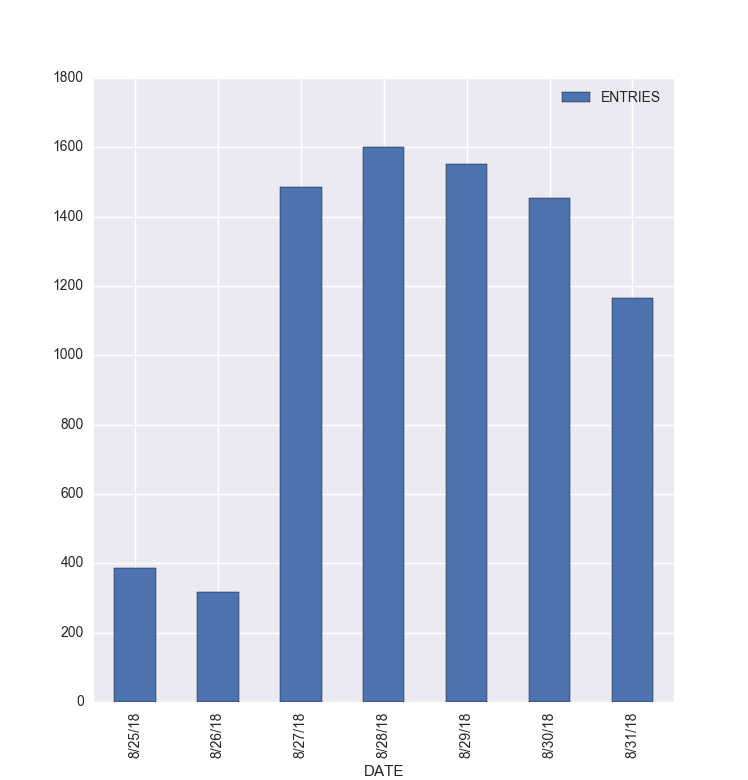
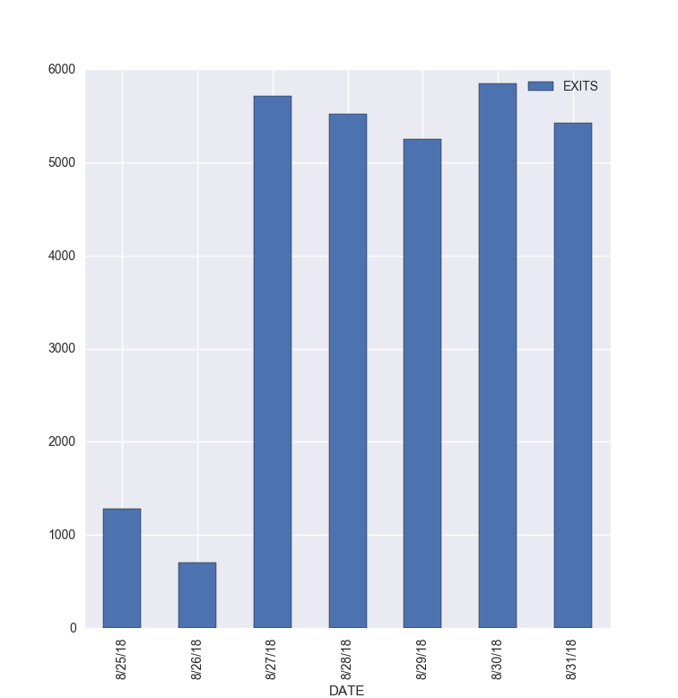
(Entries and exits (all turnstiles) at 68th Street-Hunter College station for morning commute for the week ending 1 September 2018.)Write a program that takes a weekly turnstile data file and makes a graph of all the entries and a graph of all the exits during the morning commute for your L-train station for that data. The x-axis of your histogram should be the days of the week. The bars in your plot should be the number of people entering the station between 5am and 9am (i.e. subtract the cumulative total at 5am from the cumulative total at 9am, or the closest 4-hour block measured for your station). Similarly, the bars in the second plot should be the exits from your station over the week.
Hints:
- In HC 8, we focused on a single turnstile. This program asks for all the turnstiles at your station aggegated together. That is, for the morning commute of each day, you need the total number of entries (and exits) summed up across all the turnstiles. Look at the dataFrame and identify the rows that you will need to compute this and select those to another dataFrame (like what we did in HC 8).
- Once you have retricted to your station, make two separate data frames, one containing the 5am rows for each turnstile (i.e. rows that have value == "5:00:00") and the other containing the 9am, in a similar fashion to above.
- Some new pandas commands that are incredibly useful are:
- groupby(): which you can use to group rows with the same values
- sum(): will sum up the groups by your chosen columns
entries = turnsHunter9.groupby(by = ['DATE'])['ENTRIES'].sum()-turnsHunter5.groupby(by = ['DATE'])['ENTRIES'].sum()
creates a new series (list) of those who entered each day at 9am and then subtracts off those who entered at 5am (assuming that turnsHunter9 and turnsHunter5 were selected as suggested above). - Two more useful commands:
- to_frame(): will take the series (list) that results from sum() and convert it into a dataFrame (so we can then plot it in pretty ways)
- reset_index(): fixes the column labels after the frame is created.
en = entries.to_frame().reset_index()
converts the series above into a dataFrame and then resets the index. Once done, the techniques for plotting dataFrames can be used for en.
Submit a .pdf file that contains the name of your station, as well as the plots for the morning commute entries and exits.
- HC 11: Project Plan Due Date: 16 November
The honors section will have final presentations on 12 December, addressing, the L-train tunnel closure:
For 15 months starting in April of 2019, all MTA New York City Transit (NYCT) L train service will be suspended across the East River and within Manhattan to repair damage caused by Superstorm Sandy. The L train will still run within Brooklyn, serving all stops. The temporary closure will directly affect 275,000 of the L Train's 400,000 daily riders, and indirectly affect many more throughout the city. All alternative transit services and traffic management policies are temporary for the duration of the L train closure.
In particular,
Focusing on different L-train neighborhoods, how will the residents get to work?
You may work in teams of up to 3 students to develop your presentation, which has 2 parts:
- A 60-second lightning presentation (upto 2 slides) that contains who is on the team, the neighborhoods you chose (at least one per group member and at least two, whichever is greater), and a brief description of your the effects of the L-train tunnel closure on these neighborhoods, how well will the current MTA plans mitigate the effects, and what additional transit services would be needed, and
- A computer "poster" (aka a github site) consisting of a website with a description of your neighborhoods, an analysis of the effects of the L-train tunnel closure and MTA plans on your neighborhoods and what additional services are needed.
For this group assignment, include in a .pdf file:
- The neighborhoods that your team has chosen,
- The names of the team members,
- A rough estimate of the effects of the closure on the different neighborhoods and ideas (for example: an estimate of how many riders will be displaced in your neighborhood), and
- A paragraph outlining what services (e.g. additional buses, ferries, bikes, temporary road reconfigurations or restrictions) your neighborhoods would need to mitigate the effects.
- HC 12: Catchments for L-Train Stations Due Date: 21 November
A Voronoi diagram divides a region based on the distance to a set of input points. This simple idea has many applications, one of the most famous was the work of John Snow to study the 1854 cholera outbreak. Our focus will be on mapping access to public resources and transit.
The sample program builds a Voronoi diagram will be for libraries across the city (using the library data set from NYC Library Locations (download as CSV file). Our map highlights the regions closest to each library:
To make our map, we
- First take library locations and calculate the Voronoi diagram (using the scipy package).
- While going row by row to get the library locations, add markers to the map (we're adding them as separate markers, not a MarkerCluster, since we don't want them to collapse when zooming out).
- Show the plot in a matplotlib window to make sure its working (note: if you have a separate matplotlib window you may need to close it, since the rest of the program is waiting until it's done to continue).
- Then write out the locations as a geojson file (using the geojson).
- Load the regions in as a geoJSON layer in folium.
If you are using anaconda (either spyder, idle3, or jupyter), the scipy and matplotlib packages are included. To install geojson, type at a terminal window:
pip install geojsonThe program, makeVor.py, is a bit rambling, but contains all the steps above (a better design would be to split into separate functions or files for the different tasks). Try running it on the library dataset (assumes that it is in the same folder as the program).
Note that it does very well in dense regions but has odd behavior on the edges of the map since we didn't include in the .json file any point at infinity and didn't clip the maps to the city boundaries.
Modify the program to make to make two Voronoi diagrams:
- Make a Voronoi diagram of the NYC subway stations (download as CSV). (Despite the name of the file suggesting that it's from 2010, the file contains the new Second Avenue Subway stops).
- Make a Voronoi diagram of the NYC subway stations without the L-train stations that east of the tunnel in the input file.
Submit a .pdf file with a screen capture image of your first HTML map (with all subway stations) and your second HTML map (without L-train stations east of the tunnel). For each map, center the view on your station.
- HC 13: Project Webpage Due Date: 28 November
Submit the URL of your group presentation (the two slides for the presentation) as part of a .pdf file. If you have plans to add more to the website, include in the .pdf file any changes you have planned but didn't have a chance to enter yet.
- HC 14: Draft Presentations Due Date: 30 November
Submit the slides of your group presentation (two slides) as a .pdf file. Your slides should include who is on the team, the neighborhood you chose, and a brief description of your solution to how much additional housing, and what additional services would be needed.
- HC 15: Feedback Forms Due Date: 5 December
(This is included for completeness, since the forms will be passed out and returned in section on 5 December. After you have commented on others group presentations, we will distribute the forms, so that groups can use these to improve their slides and webpages for the final presentation the following week. )
